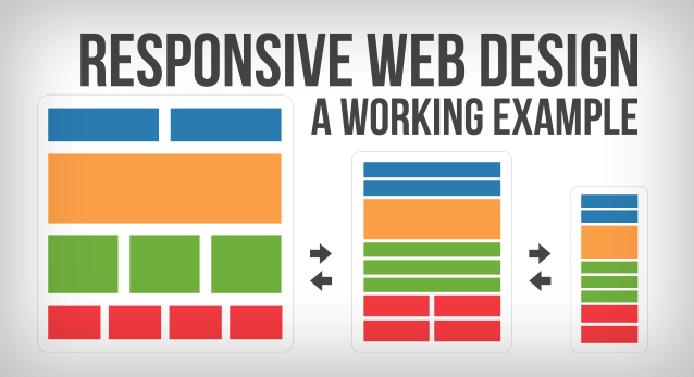
How mobile responsive web design helps SEO

With the adoption of smart phones and tablets forever on the increase, mobile optimised websites are becoming a must. It is also a ranking factor for determining your position in Google for mobile searchers.
It is also said that 70% of mobile surfers would be more likely to buy from a mobile friendly website. While the SmartInsights.com have said that 51% of local web traffic is now mobile.
So a nice push in the right direction for Search Engine Optimisation (SEO) and on-page conversions.
What is responsive web design?
So first of all we should get clear on what we mean when we say responsive. You've no doubt worked out that it translates to a website being user friendly on mobile devices.
Just because a website is suited to both desktop and mobile doesn't necessarily mean that it is responsive. There are a few ways of achieving a mobile optimised experience on a website.
Dynamic serving.
This first method works by the website detecting the device that is being used and then serving different html code (or page) based on its detection. Using this method a web developer can display content in different ways for each device. Perhaps some blocks of content only gets displayed if the user is on a desktop.
Different URLs (website addresses)
The second is using different URLs to serve the same website depending on device detection. So if it is a mobile it may redirect to m.yourwebsite.com or something similar. Using this method we can do the same things as the first.
So perhaps if you had a slideshow on the front page, we could use different resolution images depending on the device. This would improve the mobile page load times.
Responsive web design.
With responsive website design we serve exactly the same content regardless of device. This means one url for every page on the site whilst serving the same content. The page just adapts depending on the width of the screen being used to view the website.
To see a responsive design in action, just view this website using different devices. More accurately, would be to say different screen widths.
Why Google recommends responsive web design
Responsive design is Google’s recommended design pattern.
Quote from Google Developers
It makes it easier for users to share links to your website because there is only one URL for the page. Think about that in terms of optimising your social authority with social networking likes / shares. Using this method means that you only have one page accruing the social authority instead of it being split over two URLs.
You also avoid spreading the page juice between the URL's. When we say the pages juice I'm referring to the value that Google has placed on your content, that effects your position in Google.
For you, it also reduces the engineering time required for setting up virtually two websites. With responsive website design there is only one to set up that responds to the user.
Lastly, by serving the same content regardless, it will improve page load times by not having to redirect and consume less of Google's resources while crawling the website. This is said to "indirectly help Google index more of your site’s content and keep it appropriately fresh".
Improved user experience translates to higher conversion
Essentially your website is your shop front in the cloud. Where end-users can access your content from anywhere at any time.
Responsive web design is about putting your user experience first. Testing the same website for usability across all devices. By focusing on mobile user experience as well as desktop we maximise our return for the content.
The old days of only seeing half the content on a mobile is behind us. With responsive web design, when we share a link, everyone will get the same content in a user friendly way.
Responsive web design helps reduce a websites bounce rate
There is nothing worst that hitting a non-mobile website whilst using your mobile. Having to zoom in and out. Difficulty clicking links because they are too small. Having to scroll left and right, if the text is zoomed in for readability.
Having gone to all the effort of Search Engine Optimisation (SEO) and getting someone to click on your page. The last thing you want is for them to bounce back out because of poor usability. We need to make every visit count! Everyone needs to enjoy using the website and find it easy to access the content they want.
One website page, same content, same URL - Responsive web design
Mobile responsive web design maximises your return on content. We all know the ongoing investment of time required to produce great content that is optimised for people and search engines alike.
Using responsive web design, we not only increase user activity and in turn conversion, we also compound our efforts across all devices. Remember that Google treat m.yourdomain.com and yourdomain.com as different websites. Likewise for all your social activity which is a known signal for Google.
We design responsive Drupal themes
We can design and develop a responsive Drupal theme that suits your brand. Drupal is the Lego set We use for developing websites. The theme controls the way the website looks. Contact us if you need a website developed.

